1 min read
Last Updated: 26 January 2023
Much like the sweltering heat that refuses to subside, the team at inFeedo has been persistent, going all in in the last couple of months to address feedback you’ve shared overtime on Amber’s dashboard. The result? Two kickass dashboard feature upgrades that are guaranteed to blow your mind!
Last time we spoke, we unveiled our new dashboard powered by our own NLP engine. This summer…coming to an HRMS near you: People to Meet 2.0!
Hold on to your seats while we take you on a quick tour of the brand new, high-on-analytics, packed-with-insights People to Meet.
People to Meet Made Easy
Remember how the old dashboard had a quick overview of at-risk employees that you need to meet on priority? You’d click on it and it’d lead you to the People to Meet section…
Our new dashboard though…is so much more!
You can now:
1. Track critical metrics:
A quick glance will tell you exactly how many cases of at-risk employees are open and how many are resolved, the average time taken to resolve these cases (also know as ART), and (bonus!) employees identified as at-risk who have left the organization:
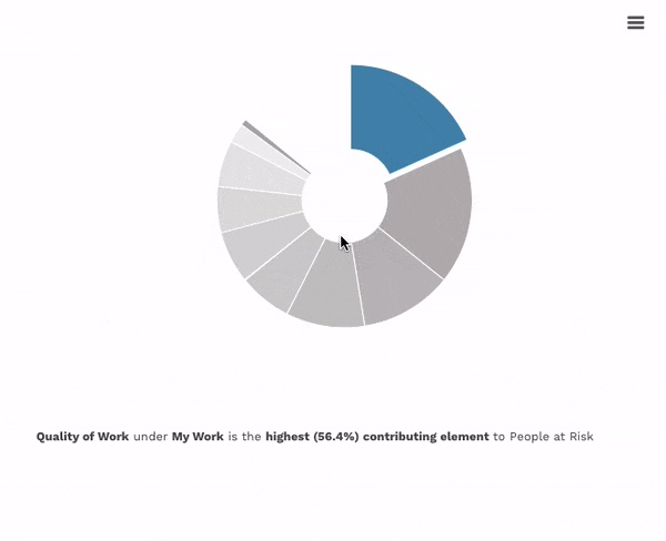
2. Gain qualitative insights under each experience driver:
Visualize and understand the factors that are negatively impacting your employees along with the number of people who’re unhappy under each driver.
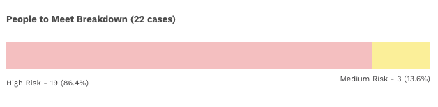
3. Categorize your priority list:
Identify the exact number and percentage of employees identified as high-risk and medium-risk. If the bar is dominantly red, it means you have more high-risk employees in the organization. The yellow indicates employees who are at medium-risk.
4. Analyze trends
In terms of at-risk employees to meet and the average resolution time for each case over time, and spot variances to draw correlations between the two.

...and all of this on the same page!
But wait…that’s not all!
This dashboard comes with a universal filter! No matter what the demography, we’ve got you covered right at the right upper corner of this dashboard:
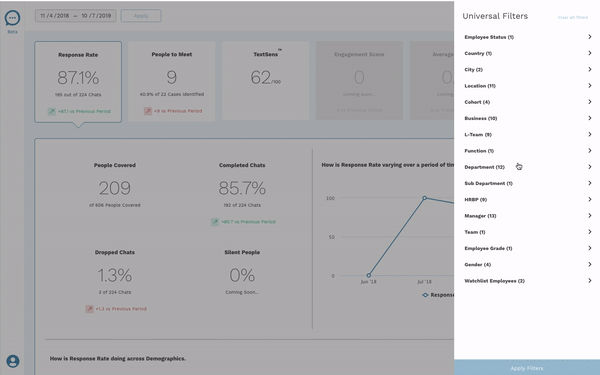
Simply click on this button right on top of your dashboard and start your beta journey today!
Got questions about the new dashboard? Drop us a line at support@infeedo.com.
Trusted by 330+ CHROs
See why global HR teams rely on Amber to listen, act, and retain their best people.